User Interfaces And The Fools Who Love Them
I love beautiful user interfaces. I tend to like interfaces that match these descriptors: minimal, functional, efficient, clean, simple, and obvious. How about some examples?
My blog editor, Windows Live Writer, is pretty good:
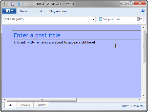
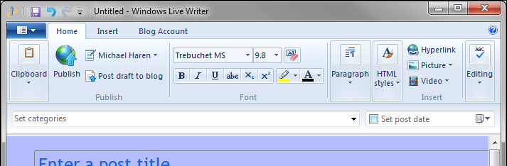
Nice and simple. Even with the ribbon extended, it’s pretty clean:
This really lets me focus on the content of the post which is important because I have a hard time focusing on anything. Browsers have certainly underscored this notion, though Google’s Chrome seems to stand out of from the pack here as it does in most areas:
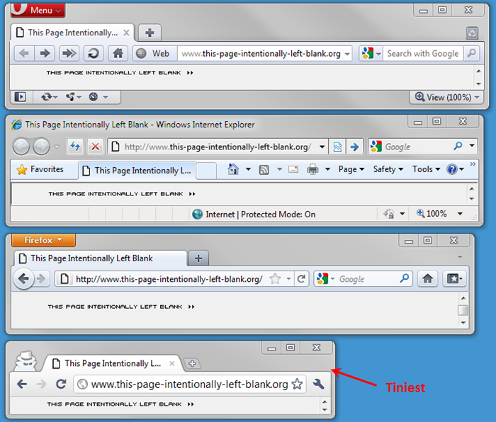
If I had to pick one thing a UI should be to make it good, I think it should be obvious. The UI should be painfully clear about how to do things. For example, in the above image it’s pretty clear how you open a new tab or how you go forwards/backwards when browsing. This goal is supported by Steve Krug’s excellent book Don’t Make Me Think:
“Your objective should always be to eliminate instructions entirely by making everything self-explanatory, or as close to it as possible. When instructions are absolutely necessary, cut them back to the bare minimum.”
It’s less obvious how you’d find out what versions we’re looking at. That’s typically in “Help > About” but none of these browsers have the typical “File Edit View Help” menu anymore.
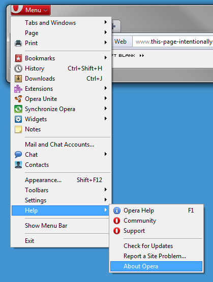
Opera buries all of its secrets under the “File” menu as I think people call it, which is fine:
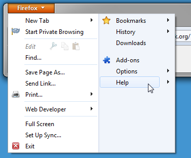
Firefox does something similar but they introduce a new style of dropdown which is a little confusing:
vs.
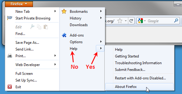
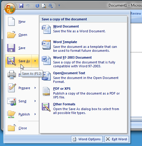
I like where they’re going but they’re not quite there yet. Office 2007 handles this better by showing you more options under the dropdown when you hover anywhere on the button:
IE8 and Chrome handle this well by hiding things behind the Help bubble and the wrench, though they drift into waters I don’t like: inventing your own controls. What I mean is, inventing a new way of doing something in the UI when well-understood, perfectly acceptable solutions already exist. If you decide to invent something, it better be good, because it’s coming at a user cost of potential confusion.
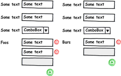
Let me tell you a story about a control I invented for a project a while back. I had a requirement that users be able to enter an unlimited number of attributes under several different categories. Like this (Foos and Bars are unlimited):
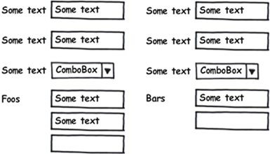
This was part of a large complicated form and there were several sections like “Foo and “Bar” above that could have an unlimited number of items entered. My super clever idea was to have the form automatically add empty boxes as users filled things in. In this way, there’d always be at least one empty box and the user wouldn’t have to bother with annoying insert/edit/delete buttons.
I loved this design. LOVED IT. Coding it was a challenge, but with some jQuery magic it all came together and it really did work great.
Except it was confusing as hell to my users! I did some accidental usability tests where I observed people using the system for the first time. They were so uncomfortable with what was happening that they were nearly paralyzed. A quick tip from me and they were happily plugging away but without my guidance they were baffled. Why? They’d never seen a UI dynamically append inputs like this before so they had no expectation that it would just happen when they started typing. And once it did happen they weren’t really sure what was going on. Further, the usual data entry metaphor was further broken when they couldn’t figure out how to delete data.
I thought I was being so clever by letting users “just type away as quickly as they want” (actual quote)—adding, editing, or removing data at any time but I was wrong. I had taken too much away in the name of minimalism. The UI was technically great, but practically not.
So what did I do? Nothing. My hallway usability tests didn’t detect anything wrong because I was asking for opinions from developers who watched the UI be born—its behavior was obvious to them. The people paying for the software loved it, too, because I taught them how to use it each week I demoed my team’s progress—they never experienced a confused moment. The voiceless victims in this game are the end-users and they’re justice sits as an aging, cosmetic, low-priority, never-fix ticket in the bug tracker.
Here’s what I’d try given the chance. I’d add the familiar (+), (-) buttons to add new rows and remove existing rows. I’d keep the auto-append behavior exactly the same, but I’d add the buttons to help guide the user’s thinking about what’s going on, and to give them something familiar to fall back on if needed. I’d also shade the empty input just slightly to acknowledge that it’s empty. Like this:
Then I’d conduct a real usability test with someone who hasn’t seen any part of this to see what they think and iterate until it stopped confusing people.