A Case For Rolling It (All) Yourself
There seems to be this idea permeating the software development industry that you should go with off-the-shelf stuff whenever possible. The theory is that custom software is expensive and doesn’t age well compared to vendor-supported packages. For libraries and backend pieces, I mostly agree with this (Log4Net FTW!). However, when it comes to user-facing applications, I think gluing together a bunch of components is usually a huge mistake.
Take as an example sites that kick you off to a Yahoo store to make a purchase. You’ve probably purchased from sites that do this well and not so well. The sites that do it well leverage the API in such a way that you barely leave their primary web server and might not even notice the transition to Yahoo.
You can tell the sites that don’t do well this when clicking a product link or anything store-related takes you to a site that looks totally different. These bad sites often send you on your voyage to the ecommerce site by making you read a page full of instructions written in serious language and bright colors, basically blaming anything that goes wrong on your failure to adhere to the instructions. This is the Internet—we don’t use instructions—guide me for crying out loud.
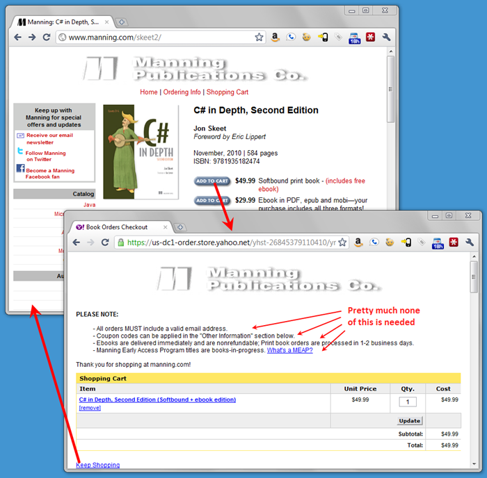
Manning publishing, a huge seller of technical books, seems to do a just OK job here. They have their own store front but pass off the heavy lifting to Yahoo. Things are integrated pretty well (though the UI change is still jarring) and you can actually buy a book easily enough. But processing ebooks isn’t so smooth. Yahoo doesn’t handle ebooks at all and thus has to hand customers back to Manning to deliver them after Yahoo takes your money. Instead of just emailing out the PDFs or taking you directly to a download link, there’s a more-complicated-than-it-needs-to-be-especially-for-a-computer-books-seller process that breaks at least a dozen of Steve Krug’s rules.
How about the good guys? Here’s an example of a site that has either rolled all their own stuff, or integrated their dependencies so tightly that they seem baked right in: Dropbox. I hear it’s built on Amazon’s cloud technologies, but I really have no idea (which is good, because I shouldn’t). Their site has lots of separate areas that seamlessly work together to share my login cookie, account info, etc.:

Those are: the Dropbox file service itself, a help site, an RFQ form (prefilled with my info), a Wiki, a referral page (prefilled just for me), and a feature voting app. The Wiki engine is definitely a third-party application (it’s credited in the footer) but it makes no difference because it’s been so tightly integrated that the theme is flawless, and my account just works without logging in again.
The bad guys call attention to the breaks between services by requiring extra instructions, confusing us with glaring UI changes, and in general, eroding the user experience. Sometimes it seems like the bad guys do this on purpose as if to call attention to how cool and sophisticated their sites are. The good guys show how awesome they are by sanding down the transitions so smooth that they are invisible and no one notices them.
If your users notice the cracks in your infrastructure, you’re doing it wrong.
Now, having said all that, let me give a few of you an out. If the technology you are using has little to do with your actual business, don’t worry about it. For example, it’s perfectly reasonable for an author to direct users elsewhere to buy a book or post questions to a forum because these aren’t what the author does and running a snazzy website doesn’t add much value. But if literally taking money for books is your direct business, you better make that process as smooth as possible.